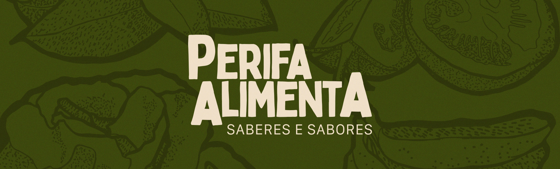
Perifa Alimenta
Identidade Visual - [2024]
[PT]
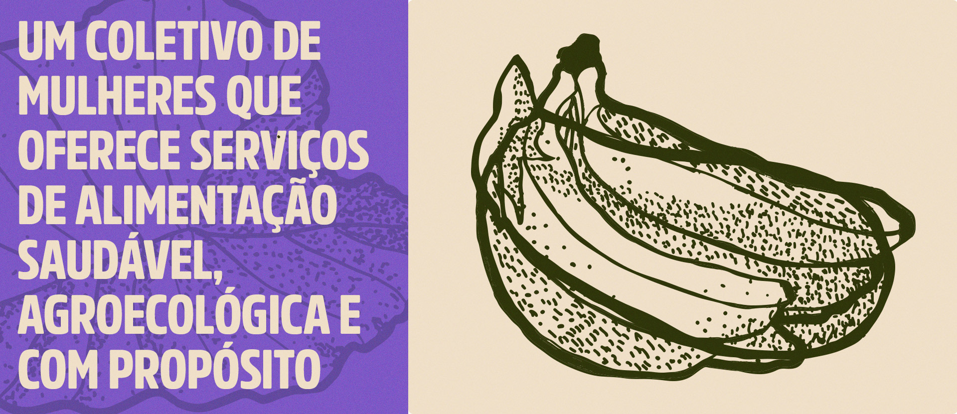
O Perifa Alimenta é um coletivo formado por mulheres que oferecem serviços de alimentação saudável, agroecológica e com propósito. A iniciativa, de impacto socioambiental, está sediada na Brasilândia, zona noroeste da cidade de São Paulo. Para as participantes, a cultura alimentar é uma manifestação de modo de vida — a síntese de saberes tradicionais transmitidos de geração em geração.
[EN]
Perifa Alimenta is a group of women who provide healthy, agroecological food with purpose. The project, which creates social and environmental impact, is based in Brasilândia, a neighborhood in the northwest of São Paulo. For the women involved, food culture is a way of life — a mix of traditional knowledge passed down through generations.
[PT]
O maior desafio do projeto foi traduzir a alma do Perifa Alimenta em uma identidade visual que fosse ao mesmo tempo clara, acessível e cheia de significado. Era preciso comunicar os valores do coletivo, aproximar as pessoas do território onde ele atua e contemplar a variedade de serviços que oferece — tudo isso sem perder a força do trabalho feito à mão, com afeto e propósito.
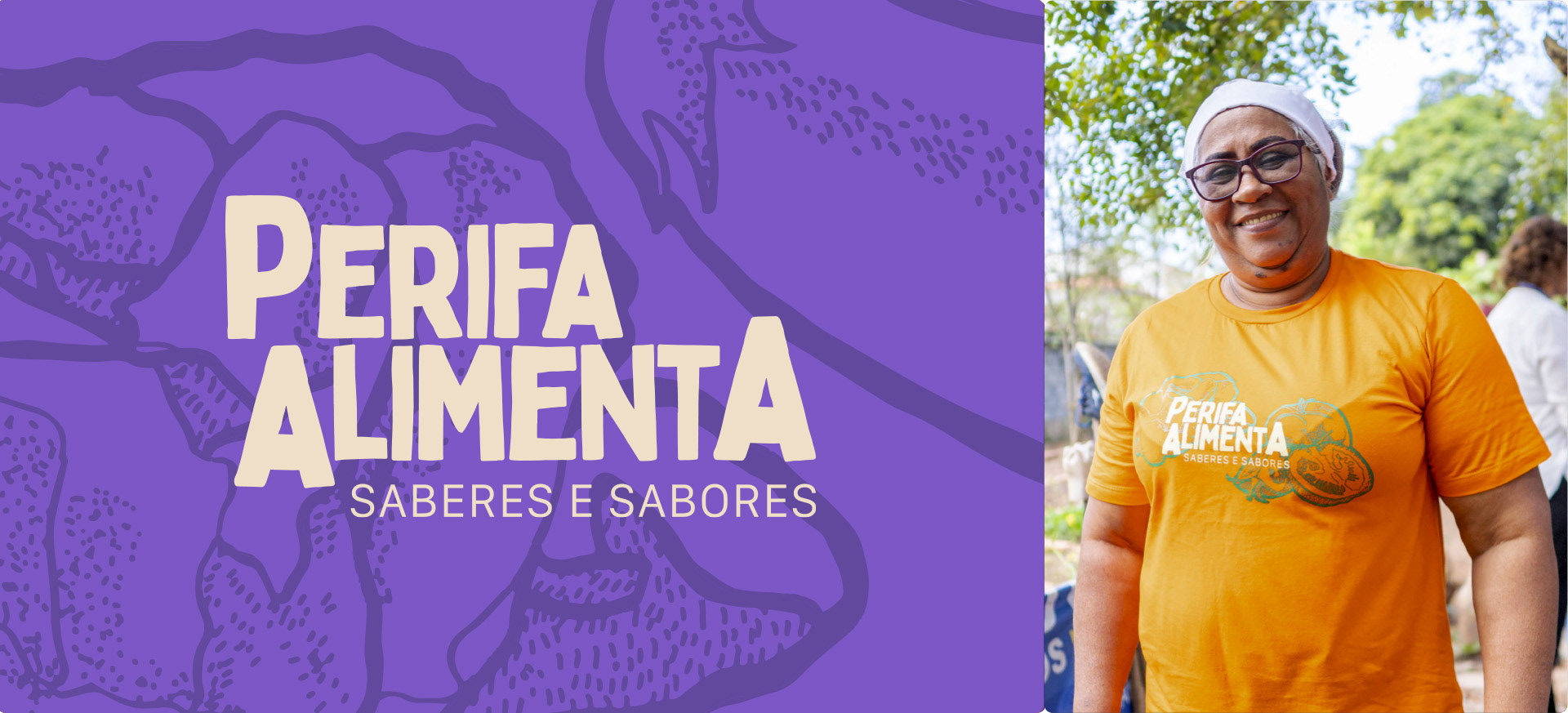
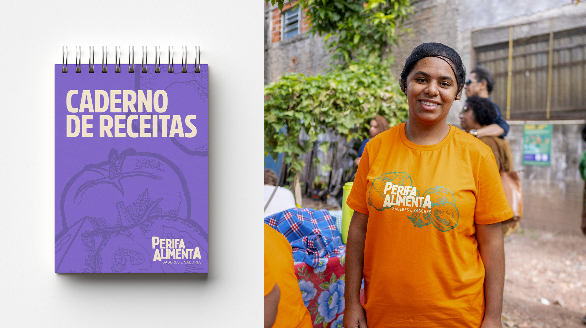
O logo foi o ponto de partida dessa construção. Seu desenho expressa a autonomia, a força e o fazer artesanal das mulheres que movem o Perifa. As variações no tamanho das letras trazem uma sensação de movimento e diversidade, reforçando que os saberes ali compartilhados são múltiplos, vivos e coletivos.
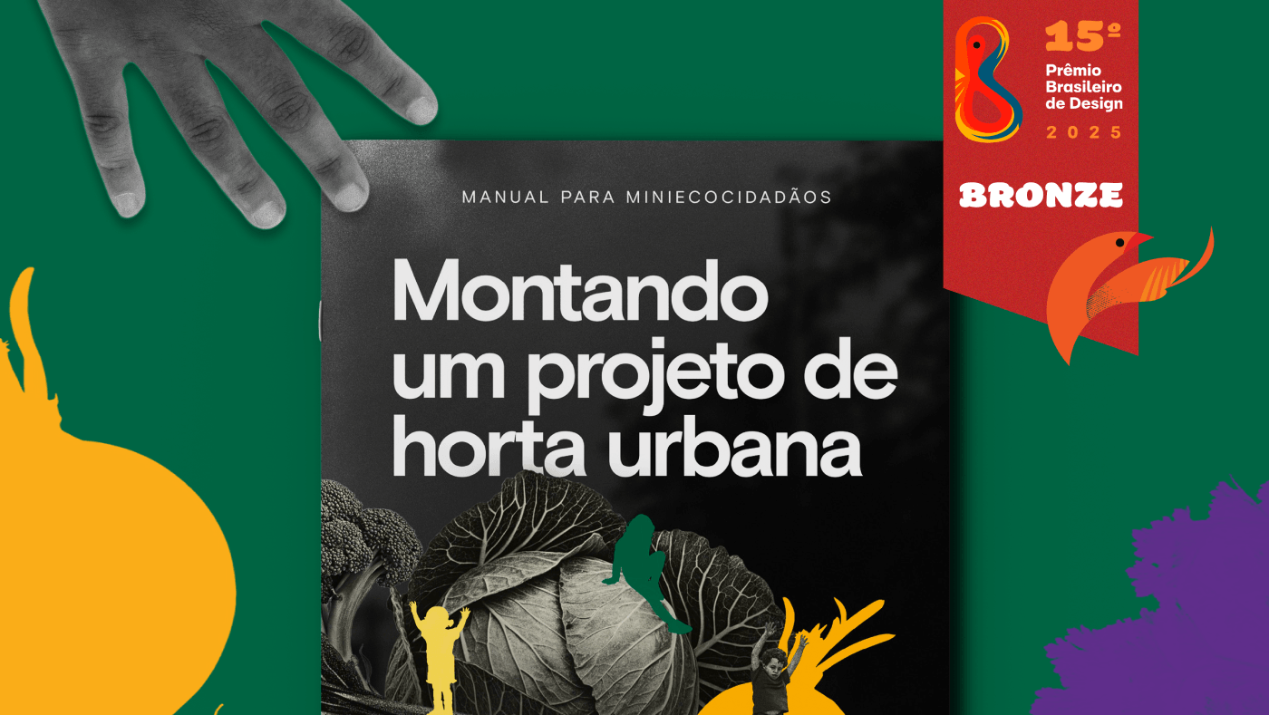
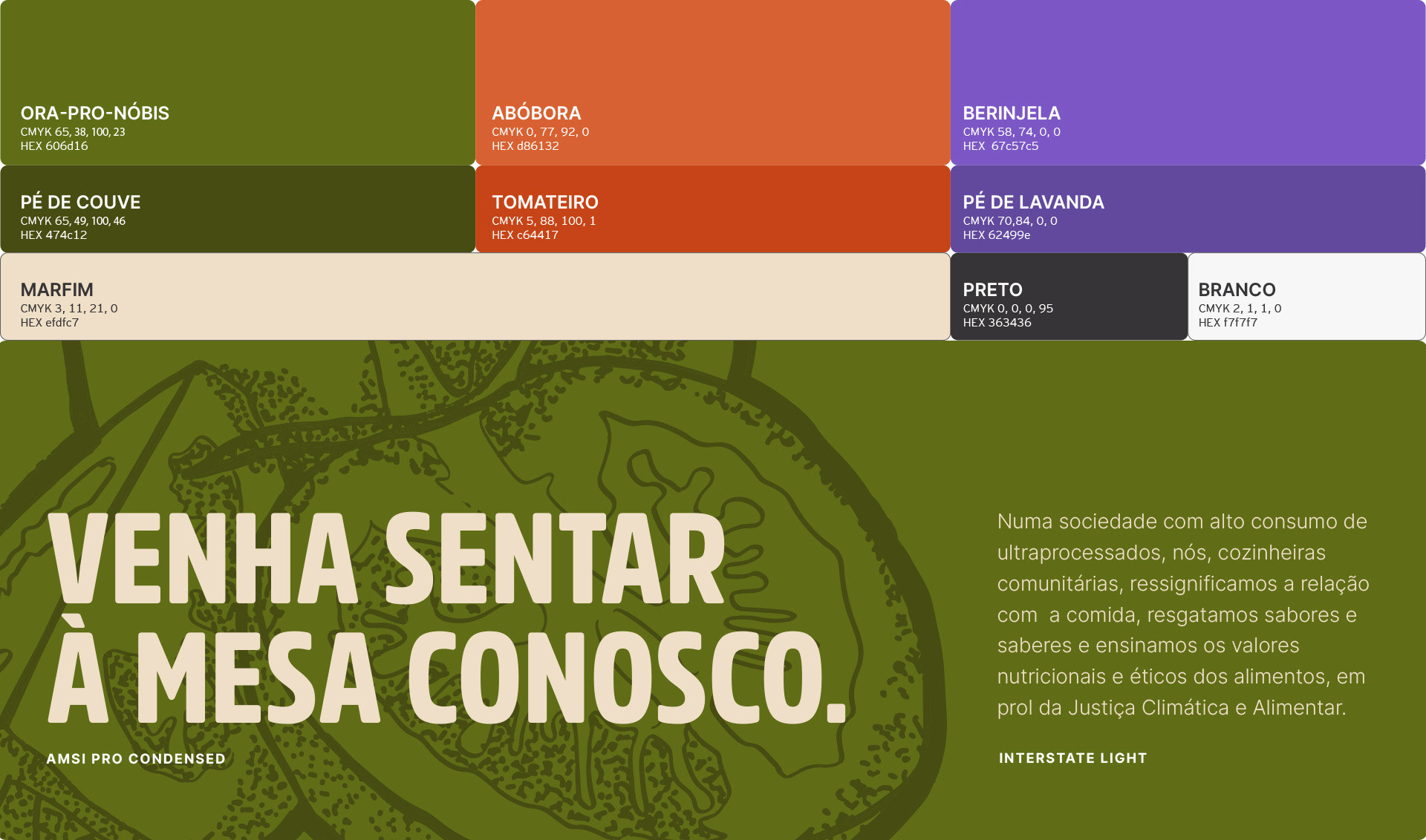
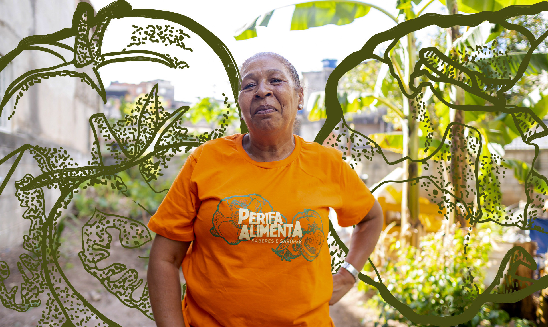
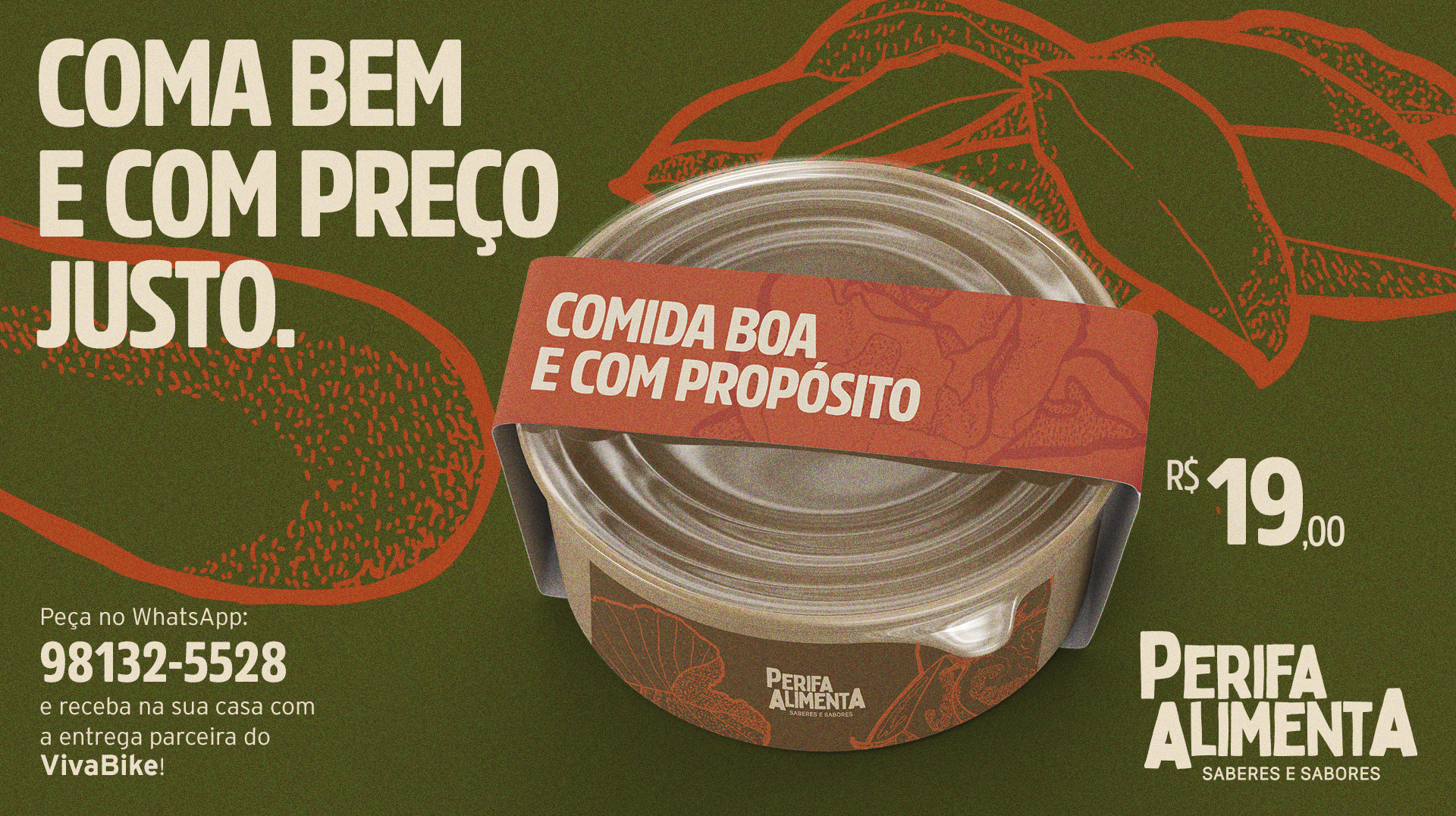
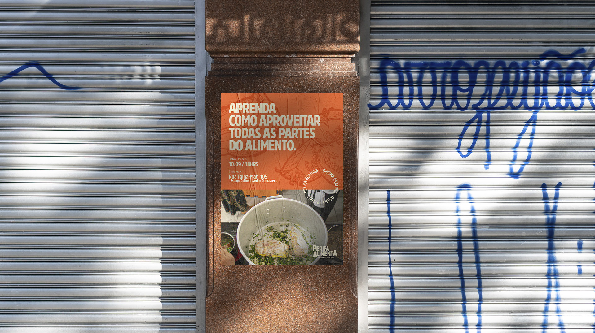
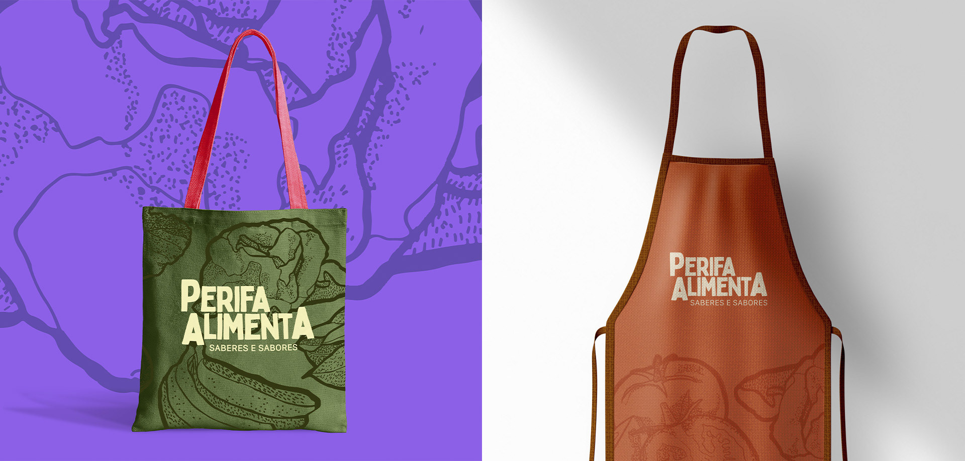
Durante o processo de criação, foram mapeados os ingredientes mais usados nas receitas do grupo, como ora-pro-nóbis, tomate, berinjela e banana. A partir deles, foram produzidos carimbos manuais, que se tornaram elementos gráficos centrais da identidade. Essa linguagem visual — marcada pela textura artesanal — aparece nos materiais de divulgação, nas embalagens e nos conteúdos digitais, sempre acompanhada por uma paleta de cores inspirada na terra, nos alimentos e no território.
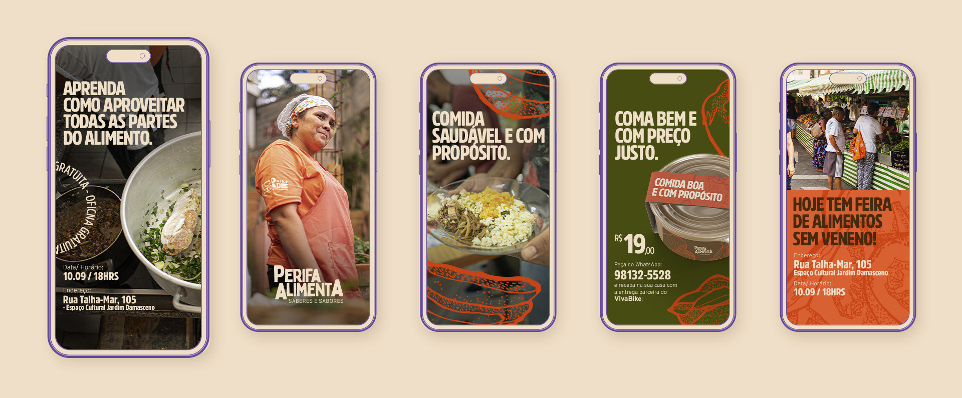
Mais do que representar o Perifa Alimenta, essa identidade visual caminha junto com o coletivo. Ela ajuda a comunicar, acolher e espalhar os saberes e sabores cultivados pelas mulheres do grupo, reafirmando o papel da periferia como espaço de potência, afeto e transformação social.
[EN]
The biggest challenge of the project was to translate the soul of Perifa Alimenta into a visual identity that would be clear, accessible, and full of meaning. The goal was to communicate the collective’s values, connect people to the territory where it operates, and reflect the variety of services it offers — all while preserving the strength of work that’s done by hand, with care and purpose.
The logo was the starting point of this construction. Its design conveys the autonomy, strength, and handmade nature of the women who lead Perifa. The variations in letter sizes bring a sense of movement and diversity, reinforcing the idea that the knowledge shared here is plural, alive, and collective.
During the creative process, the ingredients most used in the group’s recipes were mapped out, such as ora-pro-nóbis, tomatoes, eggplants, and bananas. From there, handmade stamps were created that became central visual elements of the identity. This visual language — marked by its artisanal texture — appears in promotional materials, packaging, and digital content, always accompanied by a color palette inspired by the land, the food, and the territory.
More than just representing Perifa Alimenta, this visual identity walks alongside the collective. It helps communicate, welcome, and amplify the knowledge and flavors nurtured by the group’s women — reaffirming the role of the periphery as a space of power, care, and social transformation.
Design Gráfico: Icaro Chagas
Articulação: Fabíola Bergamo
Fotografia: Paris de Araujo
Esse projeto foi realizado no contexto do ECOCIDADE, do Instituto A Cidade Precisa de Você.
Articulação: Fabíola Bergamo
Fotografia: Paris de Araujo
Esse projeto foi realizado no contexto do ECOCIDADE, do Instituto A Cidade Precisa de Você.